Precise
Use intentional hierarchy, alignment, and repetition. Every element earns its place.

 Brand system
Angle Brand System 2.0
Standards for creating consistent products, stories, and experiences with precision.
The symbol, the name, and the space around them.
Geist Sans, Mono, and a little Pixel.
Our identity and rarity spectrum. A complete interface palette.
Shared controls, patterns, and interaction standards.
Structure that makes every relationship clear.
A universe of intelligence, motion, and discovery.
01 / Principles
The Angle system balances technical clarity with human outcomes. These principles guide every interface, deck, campaign, and conversation.
Use intentional hierarchy, alignment, and repetition. Every element earns its place.
Say what matters in the fewest useful words. Make the next action unmistakable.
Create confidence through restraint, craft, and attention to small details.
Lead with customer outcomes and real behavior, not machinery or internal terminology.
04 / Logo
The Angle wordmark is the primary expression of our name. The A symbol is its compact counterpart—a forward, open form built from a single geometric gesture.
Primary wordmarkLight background Tri-angle
Use the wordmark when introducing Angle, on presentation covers, in external communications, and anywhere the symbol may not be recognized on its own.
The A is uniformly scaled to 50% inside a 1:1 black tile. Keep at least one quarter of the tile width clear on every side.
Use the complete tile at 24 px or larger on screens and 5 mm or larger in print. Use the wordmark when recognition would otherwise be ambiguous.
Use the black square with the white A on every white or light background.
Placing a freestanding black A on white, or stretching, outlining, glowing, or rotating the mark.
03 / Architecture
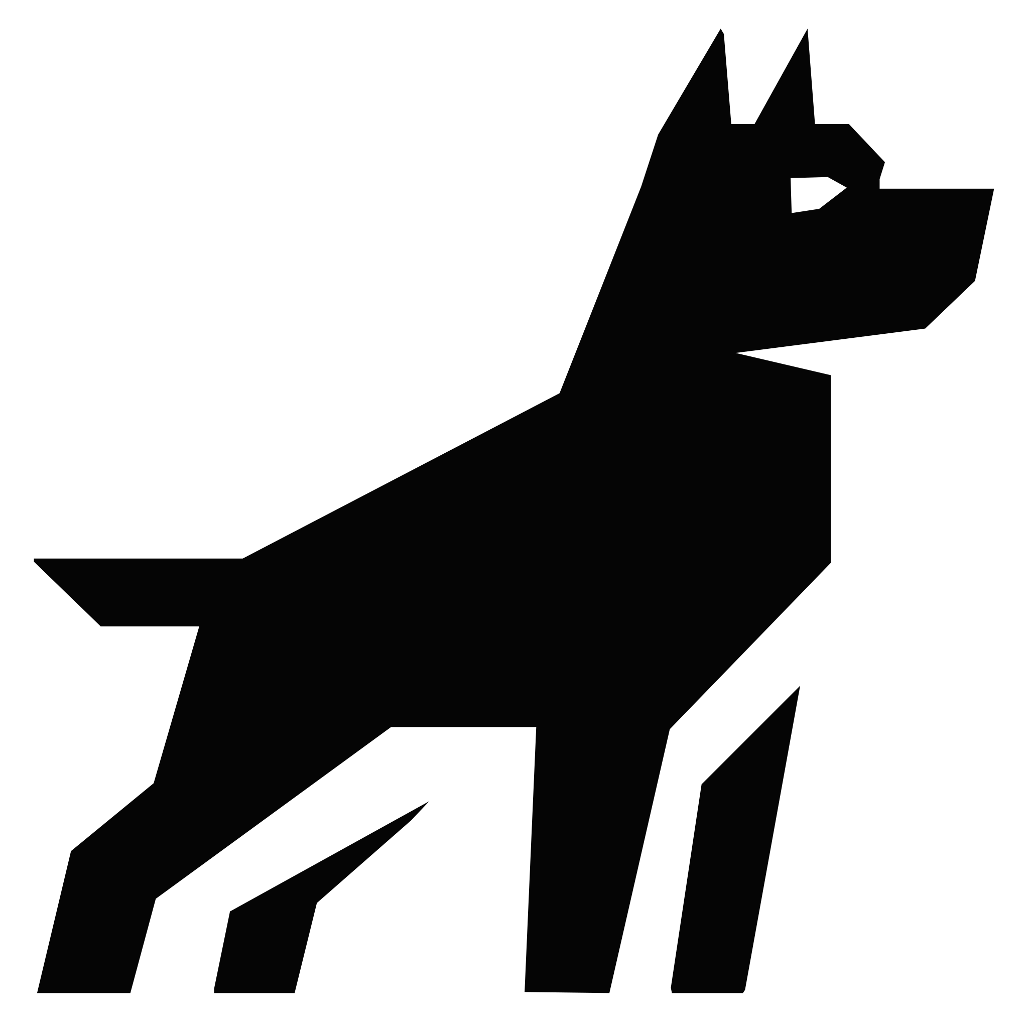
Angle products share one identity. Product names explain capability. WATCHDOG™ is an approved exception with its own supplied symbol and wordmark.
MasterbrandUse “Angle + descriptor” for products and capabilities.
Creating a new logo, typeface, or signature color for each feature.
04.1 / WATCHDOG™
The WATCHDOG™ symbol and wordmark are approved artwork within the Angle brand system. Use the supplied masters in black or white, with generous space and their original proportions.
Always write WATCHDOG™ in all caps with the trademark symbol, including in headings, navigation, and copy. Introduce the name as Angle WATCHDOG™. Preserve the supplied WATCHDOG™ wordmark, including its trademark detail. Use SVG for scalable artwork and transparent PNG where vectors are unsupported.
Redrawing, retyping, recoloring, cropping, stretching, rotating, or adding effects to either asset. WATCHDOG™ is an approved exception to the shared-symbol rule, not a template for new feature logos.
05 / Color
Black and white own the Angle identity. When color carries meaning, use the World of Warcraft item-quality spectrum as a shared language for value, status, and progression.
#050505#666666#EEEEEE#FFFFFF01 / FoundationIdentity stays monochrome.Use black, white, and neutral gray for Angle-owned surfaces, typography, navigation, and the logo.
02 / QualityColor signals relative value.Use the item-quality sequence consistently so a color means the same level of rarity across every product.
03 / RestraintAccents never take over.Apply quality color to compact indicators, borders, labels, charts, and moments of recognition—not entire branded surfaces.
A fixed progression from de-emphasized to exceptional.
ANGLE / QUALITY 00—07#9D9D9DDe-emphasized or lowest-value
#FFFFFFDefault and widely available
#1EFF00Positive progress or earned value
#0070DDSelected, notable, or advanced
#A335EEPremium or high-tier
#FF8000Major milestone or highest tier
#E6CC80Exceptional and enduring
#00CCFFLegacy or account-wide value
Geist scales for surfaces, boundaries, and operational states.
Angle’s specified identity and rarity values remain fixed. These supporting interface recipes respond to the current theme.
--brand-bg--brand-panelGray 100 / 400Gray 200 / 500Gray 300 / 600Use steps 1–3 for subtle fills and 4–6 for boundaries. If a control rests on the page background, begin its hover at step 1.
Operational colors describe what happened. Rarity colors describe relative value. Pair both with explicit labels; never substitute an Uncommon tier for a success state.
.surface {
  background: var(--brand-bg);
  color: var(--brand-fg);
  border: 1px solid var(--brand-line);
}
.control:focus-visible {
  outline: 2px solid var(--geist-blue-900);
  outline-offset: 3px;
}
Color reinforces meaning; it never carries meaning alone. Pair every quality color with a name, icon, tier, or value. Keep destructive and safety-critical states explicitly labeled rather than forcing them into the rarity scale.
06 / Typography
Geist Sans brings clarity to every interface and communication. Geist Mono gives technical details their own rhythm. Geist Pixel adds texture to a few expressive moments.
Built for loyalty.
Recognize every customer.
Angle brings store credit, membership, wallet passes, and experiences into one connected relationship.
MEMBER_VALUE $284.20 +18.4%
A new texture. The same family.
Choose a complete recipe so size, weight, leading, and tracking stay together. The preview uses the exact values below.
Introduce pages and sections.
heading-7272px / 72px · 600 weight · -4.32px tracking
heading-6464px / 64px · 600 weight · -3.84px tracking
heading-5656px / 56px · 600 weight · -3.36px tracking
heading-4848px / 56px · 600 weight · -2.88px tracking
heading-4040px / 48px · 600 weight · -2.4px tracking
heading-3232px / 40px · 600 weight · -1.28px tracking
heading-2424px / 32px · 600 weight · -0.96px tracking
heading-2020px / 26px · 600 weight · -0.4px tracking
heading-1616px / 24px · 600 weight · -0.32px tracking
heading-1414px / 20px · 600 weight · -0.28px tracking
Use only within buttons. Preserve a 44 px touch target on mobile.
button-1616px / 20px · 500 weight · 0px tracking
button-1414px / 20px · 500 weight · 0px tracking
button-1212px / 16px · 500 weight · 0px tracking
Use for a single line, paired with a control or icon.
label-2020px / 32px · 400 weight · 0px tracking
label-1818px / 20px · 400 weight · 0px tracking
label-1616px / 20px · 400 weight · 0px tracking
label-1414px / 20px · 400 weight · 0px tracking
label-14-mono14px / 20px · 400 weight · 0px tracking
label-1313px / 16px · 400 weight · 0px tracking
label-13-mono13px / 20px · 400 weight · 0px tracking
label-1212px / 16px · 400 weight · 0px tracking
label-12-mono12px / 16px · 400 weight · 0px tracking
Use for paragraphs and reading. Copy 14 and Copy 16 cover most interfaces.
copy-2424px / 36px · 400 weight · 0px tracking
copy-2020px / 36px · 400 weight · 0px tracking
copy-1818px / 28px · 400 weight · 0px tracking
copy-1616px / 24px · 400 weight · 0px tracking
copy-1414px / 20px · 400 weight · 0px tracking
copy-14-mono14px / 20px · 400 weight · 0px tracking
copy-1313px / 18px · 400 weight · 0px tracking
copy-13-mono13px / 18px · 400 weight · 0px tracking
128.40 · 284.20Strong uses 500 weight for copy and labels. Subtle uses the secondary foreground; keep headings structurally prominent. Use tabular numerals when comparing changing values. Mono is a technical role, not an emphasis style.
import { typographyRecipes } from '@/app/brand/workspace/typography';

const copy = typographyRecipes.find(r => r.name === 'copy-14')!;
<p style={{ fontSize: copy.size, lineHeight: `${copy.lineHeight}px`,
  fontWeight: copy.weight, letterSpacing: copy.tracking }}>
  Recognize every customer.
</p>Use restrained weights, tight display tracking, and comfortable body leading.
Setting paragraphs in Mono or Pixel, or replacing an approved logo with type.
07 / Grid & layout
A visible grid gives Angle work rhythm and precision. It should organize content without competing with it.
4812162432486408 / Containment
Angle interfaces begin as open compositions. Grid, spacing, alignment, typography, and contrast establish the hierarchy; visible boundaries enter only when removing them would reduce comprehension or operability.
Member value
$284.20Available across wallet and store creditSpacing, alignment, and type already express the relationship. No perimeter is needed.
One boundary makes a consequential, atomic interaction easier to understand and operate.
A section shell, card, nested card, radius, divider, and shadow repeat the same grouping.
Perimeter deletionRemove each boundary. If nothing becomes harder to understand or use, keep it removed.
Squint testContent hierarchy should read before the boxes do.
One boundaryUse one separation mechanism instead of stacking border, fill, radius, divider, and shadow.
NestingPassive sections have zero nested containers. Every exception needs an interaction, state, ownership, density, or modal reason.
Materials
Use a shared material for every elevation: a resting surface, a floating menu, or a focused dialog. Choose the lightest treatment that makes the relationship clear.
A resting surface.
Radius 6 pxOne level above the canvas.
Radius 6 pxRaised content with a clear edge.
Radius 12 pxA prominent raised surface.
Radius 12 pxA brief contextual explanation.
Radius 6 pxFloating choices and actions.
Radius 12 pxA focused, temporary decision.
Radius 12 pxA temporary full-context surface.
Radius 16 pxMaterials describe fills, strokes, radii, and shadows together. Use 6 px for base, small, and tooltip surfaces; 12 px for medium, large, menu, and modal surfaces; and 16 px for fullscreen overlays. Keep ordinary content open.
Foundations / Iconography
Use Lucide for interface icons. Keep approved Angle, partner, and tool artwork as supplied assets.
16 × 1620 × 2024 × 24Use 16 px in compact controls, 20 px in general interface actions, and 24 px for larger standalone actions. Preserve square dimensions and a consistent 2 px stroke. Align icons and text by their visual center.
A familiar icon may stand alone inside a clearly labeled button. Its accessible name describes the action and target. Decorative icons beside visible text stay hidden from assistive technology. Mobile targets remain at least 44 × 44 px even when the glyph is 16 px.
<BrandButton variant="secondary" aria-label="Open program settings">
  <Settings size={16} aria-hidden="true" />
</BrandButton>
09 / Interface
Angle interfaces use open surfaces, concise labels, and clear state changes. Add a border or surface only when it makes a real relationship or behavior easier to understand.
01Use a single clear primary action.
02Let spacing and type establish hierarchy.
03Pair status color with a text label.
02 / Contextual design
Contextual design is Angle’s approach to reducing interface sprawl. One stable surface responds to the user’s role, state, goal, and moment—bringing forward what matters now without sending people through a maze of separate screens.
ONE SURFACE / MANY MOMENTSPRIMARY PRIORITY / NOW
/settings/integrations/shopifyThe first useful action is completing the data connection.
01 / Stable frameKeep the mental model intact.Navigation, structure, and familiar controls stay put so adaptation never feels like a different product.
02 / Adaptive priorityDesign for the moment.Reorder content and change the primary action when role, product state, intent, or urgency makes something else more useful.
03 / Clear reasoningMake change understandable.Use explicit signals and plain language. People should know why an action is being shown and where it will take them.
Contextual does not mean unpredictable. Never rearrange controls mid-interaction, hide necessary access, or use opaque recommendations to manufacture engagement. Define the inputs, states, hierarchy, action label, and destination as a deterministic system that can be explained and tested.
17 / Motion
Motion explains hierarchy and state. Use short, direct transitions that feel engineered rather than theatrical.
120 msPress, hover, focus
200 msPanels, menus, state
360 msPage-level reveals
Reduced motion is part of the design. Preserve meaning and state while removing non-essential movement.
Foundations / Interaction
Keyboard, touch, motion preferences, and assistive technology are part of the design.
Use a 2 px visible focus ring with 3 px separation. Tab follows reading order. Enter activates links; Enter or Space activates buttons. Menus, dialogs, and composite controls must provide their expected arrow-key and Escape behavior.
Use 4.5:1 contrast for ordinary text and 3:1 for large text and essential non-text controls. Label every field, identify errors in text, and give failures a recovery action. Announce asynchronous outcomes without moving focus unexpectedly.
Keep touch targets at least 44 px. Avoid page-level horizontal overflow; give dense tables their own labeled scroll region. Honor reduced motion, pause effects offscreen, and preserve the native cursor when WebGPU is unavailable.
Search opens with the visible search button or Command/Ctrl K. Escape closes overlays and returns focus. Topic navigation stays within this workspace; Back and Forward restore the reading position.
10 / Imagery
Merchant photography and product imagery should feel true to their source. Angle supplies structure, typography, and context.
Use honest contrast, purposeful crops, and real customer context.
Heavy duotones, generic stock imagery, or decorative AI texture.
11 / Agents
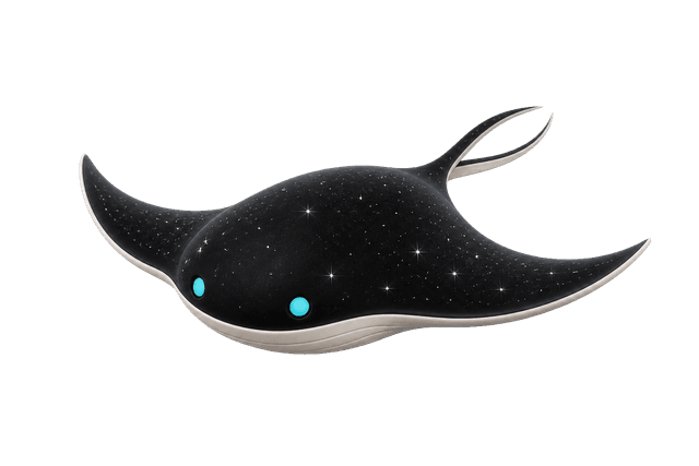
Agents are a growing roster of embodied helpers that make Angle’s intelligence contextual, expressive, and memorable. They appear with a clear purpose, produce the right prop for the moment, and leave before personality competes with the work.
Active roster
Contextual prop systemThe Astral Ray notices the moment, circles the right prop, and guides attention toward one useful next action.
A high-value member has not returned in 45 days.
PresenceFloat quietly and wait. The Astral Ray never performs for attention or competes with the primary task.
PersonalityExpress puppy-like curiosity through banking, eye direction, and brief movement. Happiness may escape as one buoyant aerial loop.
RarityUse the full particle-traced swirl only for exceptional milestones. Its scarcity is what makes the moment special.
The Retention Protocol agent is intentionally unnamed. Its form is an Astral Ray: a patient galactic familiar that floats nearby and waits to be useful. Eye direction, gentle banking, and a slow fin stroke carry most of its expression. One buoyant aerial loop may escape when it is happy; a lazy bank can pass a quiet moment. Reserve the full particle-traced swirl for exceptional milestones—its rarity is what makes it special. Future agents may change protocol and personality without changing this rule: presence should support the work, never compete with it.
12 / Plasmoids
Plasmoids are rare, sentient creatures that move through Angle’s products and world. Curious but elusive, they reveal themselves only occasionally. A sighting is understood as a sign of good fortune—a quiet signal that something valuable, surprising, or joyful is close.
001 / OBSERVED ENTITYMeaningA Plasmoid sighting signals luck, discovery, reward, or a welcome turn in the journey.
BehaviorAt rest, they hold position with only subtle internal motion. Enter a Plasmoid’s personal space and it glides away in one long, smooth motion, sensing the limits of its space and curving naturally before it reaches them. Catch one and it will swell, shake, then jet in two or three angry directions.
AppearancesLet them emerge at rare moments of discovery, celebration, transition, or delight. Their scarcity preserves their meaning.
Their origins are unknown. Visually, Plasmoids live on Angle Black, move slowly, and carry colors from the item-quality spectrum. Never use them as logos, routine interface decoration, or status feedback. Always provide a still sighting when reduced motion is requested or WebGL is unavailable.
13 / Flow particles
Flow Particles are tiny microns of data moving beneath every Angle product. Most of the time, the interface holds them out of sight. Occasionally, a harmless glitch thins the surface and the current becomes visible—a fleeting look at the living fabric behind the system.
TRACE / SYSTEM VEILFor a moment,
the system shows through.
MeaningFlow Particles reveal the connective current carrying value, activity, and momentum through Angle.
BehaviorThey travel in continuous fields, bending around exchanges and gathering briefly where the system is most active.
SightingsUse a glimpse at rare transitions, hidden states, or moments when the boundary between interface and infrastructure becomes thin.
Flow Particles are not literal customer records, and a sighting never implies exposed personal data or a broken product. Keep fields abstract, temporary, and non-interactive. Use one field at a time, preserve the black frame, and provide a still trace for reduced motion or unavailable WebGL.
14 / Collapsing Timelines
Every decision leaves a brief wake of paths that almost were. This treatment turns the Angle pointer into the chosen path while nearby possibilities dissolve into an aether vapor trail.
AETHER TRACE / POSSIBILITY COLLAPSECollapsing Timelines: "An aether vapor trail of discarded possibilities, evaporating the moment a single path is chosen."
ANGLE MOTION / DECISION TRAILMOVE POINTER / CHOOSE A PATHMeaningThe Angle symbol marks the path being chosen. The vapor behind it holds the possibilities that collapse around that decision.
BehaviorMovement emits one continuous white trail that follows the pointer, thins naturally, and evaporates within six seconds.
UseReserve the treatment for high-expression Angle-owned spaces, landmark entry pages, and contained brand demonstrations.
Collapsing Timelines is distinct from Flow Particles: it visualizes discarded possibilities around a chosen path, not data moving beneath the system. Keep the approved Angle symbol upright, preserve normal pointer behavior, contain the trail to its intended frame, and immediately restore the native cursor when WebGPU is unavailable, reduced motion is requested, or the pointer leaves the experience.
15 / Warp
Warp is the sensation of passing through the system at impossible speed. Angle uses it when transporting someone into a genuinely different product context—turning navigation into a brief journey through time and space.
TRANSIT / CONTEXT SHIFTLeave one context.
Arrive in another.
MeaningWarp marks a true contextual crossing: the user is leaving one part of the Angle universe and arriving somewhere meaningfully different.
BehaviorBegin controlled, accelerate toward the viewer, and resolve decisively into the destination. The movement should feel fast, dimensional, and inevitable.
UseReserve it for full-context transitions, hidden worlds, or rare jumps between major product areas—not ordinary navigation.
Warp is a transition, never a loading screen or a reason to delay the destination. Keep the full passage between 700 and 1,000 milliseconds, use a monochrome field on Angle Black, and never place controls or essential copy inside it. Replace the journey with a direct crossfade when reduced motion is requested.
16 / Astral plane
When Angle presents an object in 3D, it should respond to the person viewing it. Give people direct control across the object’s X, Y, and Z axes so they can inspect every side instead of watching a fixed animation.
DIRECT MANIPULATION / X Y ZIf it has depth,
let people move it.
AxesSupport inspection across X, Y, and Z. Do not lock a dimensional object to a single turntable view unless its shape requires it.
InputUse drag and touch to rotate, wheel and pinch to zoom, and provide keyboard equivalents for every essential movement.
RecoveryKeep focus visible, preserve the object in frame, and provide a predictable reset to its useful default orientation.
Interaction should improve understanding, not gate it. Label the available controls, keep nearby navigation usable, and provide an equivalent static view when 3D rendering is unavailable. Reduced motion removes autonomous movement—not direct manipulation initiated by the user.
18 / Voice
Angle speaks like an experienced operator: concise, specific, optimistic, and comfortable with complexity without exposing it.
Lead with the outcome. Use active voice and concrete nouns.
Prefer a real mechanism or result over a broad promise.
Labels should explain the next action, not the interface itself.
State the problem calmly and provide a useful recovery path.
21 / Applications
Use the same foundations across software and creative work. Templates change format, not identity.
/ 2026Building loyalty for dogs and their people.
22 / Resources
Download approved assets directly. Do not recreate the symbol from screenshots or substitute a lookalike.
WATCHDOG™ symbol and wordmark: download black and white SVGs and transparent PNGs.
Symbol tile / lightSVG ↓Symbol / whiteSVG ↓Wordmark / whiteSVG ↓Tri-angleSVG ↓MDAngle brand skillMD ↓The supplied A artwork is currently the approved web master for this library. Replace it with the final trademark-ready vector master before broad external distribution.











Components
Shared controls and interaction standards. Keep scrolling to explore every component, or jump directly to an example.
Components
Reserves predictable space for media before it loads.
Choose ratios from the content format, prevent layout shift, and avoid cropping information-bearing imagery.
Ratio frame · Media · Fallback
This is a visual and interaction reference for Angle’s public web surfaces. Product application UI has its own implementation standard.
Import the existing demonstration to reproduce this specimen:
import ComponentPreview from '@/app/brand/components/ComponentPreview';

<ComponentPreview slug="aspect-ratio" />These are local reference examples. Verify the behavior required by your product before promoting a demonstration into a shared production component.
Download shared primitives ↓Components
Represents a person or organization in compact interface contexts.
Use real imagery when available and deterministic initials as fallback. Never rely on avatars as the only identity label.
Image · Fallback · Status · Accessible name
This is a visual and interaction reference for Angle’s public web surfaces. Product application UI has its own implementation standard.
Import the existing demonstration to reproduce this specimen:
import ComponentPreview from '@/app/brand/components/ComponentPreview';

<ComponentPreview slug="avatar" />These are local reference examples. Verify the behavior required by your product before promoting a demonstration into a shared production component.
Download shared primitives ↓Components
Displays compact status, category, or quality information.
Keep badges short and pair item-quality color with a written tier or value.
Container · Label · Optional indicator
This is a visual and interaction reference for Angle’s public web surfaces. Product application UI has its own implementation standard.
Import the existing demonstration to reproduce this specimen:
import ComponentPreview from '@/app/brand/components/ComponentPreview';

<ComponentPreview slug="badge" />These are local reference examples. Verify the behavior required by your product before promoting a demonstration into a shared production component.
Download shared primitives ↓Components
Presents dates for selection or reference.
Keep today, selection, unavailable dates, and range boundaries distinct without flooding the grid with color.
Month navigation · Weekdays · Date grid · Selection
This is a visual and interaction reference for Angle’s public web surfaces. Product application UI has its own implementation standard.
Import the existing demonstration to reproduce this specimen:
import ComponentPreview from '@/app/brand/components/ComponentPreview';

<ComponentPreview slug="calendar" />Use one field contract across typed and pointer input. Preserve locale, timezone, and unavailable-date rules.
Field · Trigger · Calendar · Selected date · Validation
This is a visual and interaction reference for Angle’s public web surfaces. Product application UI has its own implementation standard.
Import the existing demonstration to reproduce this specimen:
import ComponentPreview from '@/app/brand/components/ComponentPreview';

<ComponentPreview slug="date-picker" />These are local reference examples. Verify the behavior required by your product before promoting a demonstration into a shared production component.
Download shared primitives ↓Components
Groups content that must be understood and acted on as one atomic unit.
Open canvas is the default. Use a card only when one perimeter clarifies a shared action, state, ownership, or dense repeated object. Never wrap a passive section or nest cards without an explicit behavioral reason.
Updated after the member’s latest return.
Container · Header · Content · Footer or action
This is a visual and interaction reference for Angle’s public web surfaces. Product application UI has its own implementation standard.
Import the existing demonstration to reproduce this specimen:
import ComponentPreview from '@/app/brand/components/ComponentPreview';

<ComponentPreview slug="card" />These are local reference examples. Verify the behavior required by your product before promoting a demonstration into a shared production component.
Download shared primitives ↓Components
Browses a short sequence of visual peers in constrained space.
Use only when sequence matters and all items remain reachable by keyboard, controls, and touch.
$128.40 available
Viewport · Track · Slides · Previous · Next · Position
This is a visual and interaction reference for Angle’s public web surfaces. Product application UI has its own implementation standard.
Import the existing demonstration to reproduce this specimen:
import ComponentPreview from '@/app/brand/components/ComponentPreview';

<ComponentPreview slug="carousel" />These are local reference examples. Verify the behavior required by your product before promoting a demonstration into a shared production component.
Download shared primitives ↓Components
Makes a trend, comparison, or distribution easier to understand than a table alone.
Lead with the insight, label values directly, and reserve item-quality colors for genuine value or progression meaning.
Title · Plot · Axes · Series · Legend · Insight
This is a visual and interaction reference for Angle’s public web surfaces. Product application UI has its own implementation standard.
Import the existing demonstration to reproduce this specimen:
import ComponentPreview from '@/app/brand/components/ComponentPreview';

<ComponentPreview slug="chart" />These are local reference examples. Verify the behavior required by your product before promoting a demonstration into a shared production component.
Download shared primitives ↓Components
Selects independent options or confirms an explicit agreement.
Use a crisp square control, direct label, and an indeterminate state for partial group selection.
Control · Checkmark · Label · Supporting copy
This is a visual and interaction reference for Angle’s public web surfaces. Product application UI has its own implementation standard.
Import the existing demonstration to reproduce this specimen:
import ComponentPreview from '@/app/brand/components/ComponentPreview';

<ComponentPreview slug="checkbox" />These are local reference examples. Verify the behavior required by your product before promoting a demonstration into a shared production component.
Download shared primitives ↓Components
Use inline memberId for a short identifier. Use a labeled code block for a complete example. Preserve exact whitespace and allow local horizontal scrolling for long lines.
const member = {
  name: 'Avery Morgan',
  tier: 'Epic',
  availableValue: 284.20,
};

// Long lines scroll inside the example, preserving the page width.
const formattedValue = new Intl.NumberFormat('en-US', { style: 'currency', currency: 'USD' }).format(member.availableValue);
Examples render as escaped text, never executable markup. The preview uses plain code so copying preserves exactly what is shown.
<CodeBlock label="Example" code={source} />These are local reference examples. Verify the behavior required by your product before promoting a demonstration into a shared production component.
Download shared primitives ↓Components
Finds destinations and actions through a keyboard-first palette.
Return ranked, contextual results with visible shortcuts and safe empty states. Search should not become hidden navigation.
Search · Result groups · Command · Shortcut · Empty state
This is a visual and interaction reference for Angle’s public web surfaces. Product application UI has its own implementation standard.
Import the existing demonstration to reproduce this specimen:
import ComponentPreview from '@/app/brand/components/ComponentPreview';

<ComponentPreview slug="command" />These are local reference examples. Verify the behavior required by your product before promoting a demonstration into a shared production component.
Download shared primitives ↓Components
Displays one complete conversational contribution and its actions.
Support text, structured content, attachments, citations, status, and accessible actions without forcing everything into a bubble.
Author · Body · Attachments · Metadata · Actions
This is a visual and interaction reference for Angle’s public web surfaces. Product application UI has its own implementation standard.
Import the existing demonstration to reproduce this specimen:
import ComponentPreview from '@/app/brand/components/ComponentPreview';

<ComponentPreview slug="message" />Keep bubbles structurally quiet. Differentiate roles with alignment and labels rather than loud color.
Your member import is ready to review.
10:42 AMShow me any rows that need attention.
10:43 AM · SentAuthor · Content · Timestamp · State
This is a visual and interaction reference for Angle’s public web surfaces. Product application UI has its own implementation standard.
Import the existing demonstration to reproduce this specimen:
import ComponentPreview from '@/app/brand/components/ComponentPreview';

<ComponentPreview slug="bubble" />Show file name, type, size, upload state, and a clear remove or retry action.
File icon · Name · Metadata · Progress · Action
This is a visual and interaction reference for Angle’s public web surfaces. Product application UI has its own implementation standard.
Import the existing demonstration to reproduce this specimen:
import ComponentPreview from '@/app/brand/components/ComponentPreview';

<ComponentPreview slug="attachment" />Use concise labels and a one-pixel rule. Markers orient; they do not compete with the conversation.
Rule · Label · Timestamp or count
This is a visual and interaction reference for Angle’s public web surfaces. Product application UI has its own implementation standard.
Import the existing demonstration to reproduce this specimen:
import ComponentPreview from '@/app/brand/components/ComponentPreview';

<ComponentPreview slug="marker" />Preserve the reader’s position, reveal new-message state, and scroll only when they are already following the latest turn.
History · Scroll viewport · New marker · Jump action
This is a visual and interaction reference for Angle’s public web surfaces. Product application UI has its own implementation standard.
Import the existing demonstration to reproduce this specimen:
import ComponentPreview from '@/app/brand/components/ComponentPreview';

<ComponentPreview slug="message-scroller" />These are local reference examples. Verify the behavior required by your product before promoting a demonstration into a shared production component.
Download shared primitives ↓Components
MEMBER_00284Copy reports success through a live region. If clipboard access is unavailable, a selected read-only field provides the same value for manual copying.
<CopyButton value="MEMBER_00284" label="Copy member identifier" />These are local reference examples. Verify the behavior required by your product before promoting a demonstration into a shared production component.
Download shared primitives ↓Components
Focuses a contained task without leaving the current context.
Reserve for short tasks and decisions. Trap focus, label the dialog, and provide an obvious close path.
Backdrop · Surface · Title · Content · Actions · Close
This is a visual and interaction reference for Angle’s public web surfaces. Product application UI has its own implementation standard.
Import the existing demonstration to reproduce this specimen:
import ComponentPreview from '@/app/brand/components/ComponentPreview';

<ComponentPreview slug="dialog" />State the consequence plainly and give the safe action equal visual access. Never preselect destruction.
Backdrop · Warning title · Consequence · Cancel · Confirm
This is a visual and interaction reference for Angle’s public web surfaces. Product application UI has its own implementation standard.
Import the existing demonstration to reproduce this specimen:
import ComponentPreview from '@/app/brand/components/ComponentPreview';

<ComponentPreview slug="alert-dialog" />These are local reference examples. Verify the behavior required by your product before promoting a demonstration into a shared production component.
Download shared primitives ↓Components
Establishes left-to-right or right-to-left reading and control behavior.
Use logical spacing and directional icons so the system can mirror without manual one-off overrides.
Direction provider · Content · Logical controls
This is a visual and interaction reference for Angle’s public web surfaces. Product application UI has its own implementation standard.
Import the existing demonstration to reproduce this specimen:
import ComponentPreview from '@/app/brand/components/ComponentPreview';

<ComponentPreview slug="direction" />These are local reference examples. Verify the behavior required by your product before promoting a demonstration into a shared production component.
Download shared primitives ↓Components
Expands sections in a vertically stacked information set.
Use when section titles remain useful while content is hidden. Do not conceal essential instructions.
Angle uses Shopify’s native store credit so value stays clear and usable online or in store.
Angle uses Shopify’s native store credit so value stays clear and usable online or in store.
Angle uses Shopify’s native store credit so value stays clear and usable online or in store.
Item · Trigger · Chevron · Panel
This is a visual and interaction reference for Angle’s public web surfaces. Product application UI has its own implementation standard.
Import the existing demonstration to reproduce this specimen:
import ComponentPreview from '@/app/brand/components/ComponentPreview';

<ComponentPreview slug="accordion" />Use for optional detail attached to a clear parent; maintain the trigger in place when content changes.
Trigger · State indicator · Content region
This is a visual and interaction reference for Angle’s public web surfaces. Product application UI has its own implementation standard.
Import the existing demonstration to reproduce this specimen:
import ComponentPreview from '@/app/brand/components/ComponentPreview';

<ComponentPreview slug="collapsible" />These are local reference examples. Verify the behavior required by your product before promoting a demonstration into a shared production component.
Download shared primitives ↓Components
Brings a temporary task up from the lower edge, especially on touch screens.
Use for mobile-first supporting tasks and preserve a visible dismissal gesture and button.
Backdrop · Handle · Surface · Content · Actions
This is a visual and interaction reference for Angle’s public web surfaces. Product application UI has its own implementation standard.
Import the existing demonstration to reproduce this specimen:
import ComponentPreview from '@/app/brand/components/ComponentPreview';

<ComponentPreview slug="drawer" />These are local reference examples. Verify the behavior required by your product before promoting a demonstration into a shared production component.
Download shared primitives ↓Components
Communicates a relevant status, warning, or recovery path in context.
A note explains local context. A banner describes a condition affecting the whole view. A failure belongs beside the affected task and offers recovery.
Members will see this program after it is published.
Check the reward amount before continuing.
The example connection is unavailable. Your draft is safe.
<Feedback tone="error" title="Could not save the draft">
  <p>Your changes are still available. Try again.</p>
  <BrandButton onClick={retry}>Try again</BrandButton>
</Feedback>Name the condition, explain its effect, and provide the next action. Color supports the message but never carries it alone.
Publish when the member experience is ready.
Icon · Title · Description · Action
This is a visual and interaction reference for Angle’s public web surfaces. Product application UI has its own implementation standard.
Import the existing demonstration to reproduce this specimen:
import ComponentPreview from '@/app/brand/components/ComponentPreview';

<ComponentPreview slug="alert" />Distinguish first use, no results, and cleared data. Offer one relevant next action.
Clear a filter or search for a different customer.
Visual · Title · Explanation · Primary action
This is a visual and interaction reference for Angle’s public web surfaces. Product application UI has its own implementation standard.
Import the existing demonstration to reproduce this specimen:
import ComponentPreview from '@/app/brand/components/ComponentPreview';

<ComponentPreview slug="empty" />These are local reference examples. Verify the behavior required by your product before promoting a demonstration into a shared production component.
Download shared primitives ↓Components
Provides the canonical anatomy for labels, controls, help, and validation.
Field is the Angle form foundation. Keep its vertical rhythm stable across every control type and state.
Label · Control · Description · Validation message
This is a visual and interaction reference for Angle’s public web surfaces. Product application UI has its own implementation standard.
Import the existing demonstration to reproduce this specimen:
import ComponentPreview from '@/app/brand/components/ComponentPreview';

<ComponentPreview slug="field" />Use sentence case and concrete nouns. Keep required and optional treatment consistent.
Labels use sentence case and remain visible after entry.
Text · Requirement indicator · Association
This is a visual and interaction reference for Angle’s public web surfaces. Product application UI has its own implementation standard.
Import the existing demonstration to reproduce this specimen:
import ComponentPreview from '@/app/brand/components/ComponentPreview';

<ComponentPreview slug="label" />These are local reference examples. Verify the behavior required by your product before promoting a demonstration into a shared production component.
Download shared primitives ↓Compose forms from the Field anatomy. Connect React Hook Form, TanStack Form, or native submission to the same labels, help text, validation, and focus behavior. Keep framework migration notes here rather than introducing a competing Form component.
Keep one visual and accessibility contract, then connect the form library required by the product.
Components
Previews useful information without opening a new context.
Treat hover as enhancement: keyboard focus must reveal the same content, and touch must have a direct path.
$1,842 lifetime value · 12 orders
Trigger · Preview surface · Summary · Optional action
This is a visual and interaction reference for Angle’s public web surfaces. Product application UI has its own implementation standard.
Import the existing demonstration to reproduce this specimen:
import ComponentPreview from '@/app/brand/components/ComponentPreview';

<ComponentPreview slug="hover-card" />These are local reference examples. Verify the behavior required by your product before promoting a demonstration into a shared production component.
Download shared primitives ↓Components
Collects a short, single-line value.
3 members match
Search keeps its visible label. Clear returns focus to the input; Escape clears the current query. Announce result changes without moving focus.
<SearchField label="Search members" value={query} onChange={setQuery} />Labels remain outside the field; placeholder text demonstrates format and never replaces the label.
Label · Control · Placeholder or value · Help or error
This is a visual and interaction reference for Angle’s public web surfaces. Product application UI has its own implementation standard.
Import the existing demonstration to reproduce this specimen:
import ComponentPreview from '@/app/brand/components/ComponentPreview';

<ComponentPreview slug="input" />Add only information that changes interpretation or enables an immediate field-level action.
Prefix · Input · Suffix · Action
This is a visual and interaction reference for Angle’s public web surfaces. Product application UI has its own implementation standard.
Import the existing demonstration to reproduce this specimen:
import ComponentPreview from '@/app/brand/components/ComponentPreview';

<ComponentPreview slug="input-group" />These are local reference examples. Verify the behavior required by your product before promoting a demonstration into a shared production component.
Download shared primitives ↓Components
Collects a short one-time verification code.
Support paste, autofill, clear error recovery, and a single accessible field model despite segmented visuals.
Label · Code slots · Caret · Error · Resend action
This is a visual and interaction reference for Angle’s public web surfaces. Product application UI has its own implementation standard.
Import the existing demonstration to reproduce this specimen:
import ComponentPreview from '@/app/brand/components/ComponentPreview';

<ComponentPreview slug="input-otp" />These are local reference examples. Verify the behavior required by your product before promoting a demonstration into a shared production component.
Download shared primitives ↓Components
Represents one object in a list with metadata and an optional action.
Keep the click target unambiguous and align repeated metadata consistently across a collection.
Leading visual · Title · Metadata · Action
This is a visual and interaction reference for Angle’s public web surfaces. Product application UI has its own implementation standard.
Import the existing demonstration to reproduce this specimen:
import ComponentPreview from '@/app/brand/components/ComponentPreview';

<ComponentPreview slug="item" />These are local reference examples. Verify the behavior required by your product before promoting a demonstration into a shared production component.
Download shared primitives ↓Components
Displays a keyboard key or shortcut.
Use the user’s platform conventions and keep shortcuts supplementary to visible controls.
Key cap · Key label · Sequence separator
This is a visual and interaction reference for Angle’s public web surfaces. Product application UI has its own implementation standard.
Import the existing demonstration to reproduce this specimen:
import ComponentPreview from '@/app/brand/components/ComponentPreview';

<ComponentPreview slug="kbd" />These are local reference examples. Verify the behavior required by your product before promoting a demonstration into a shared production component.
Download shared primitives ↓Components
Moves through a bounded collection of result pages.
Show current position, preserve filters, and prefer cursor-backed data even when the interface displays pages.
Previous · Page links · Current page · Next
This is a visual and interaction reference for Angle’s public web surfaces. Product application UI has its own implementation standard.
Import the existing demonstration to reproduce this specimen:
import ComponentPreview from '@/app/brand/components/ComponentPreview';

<ComponentPreview slug="pagination" />These are local reference examples. Verify the behavior required by your product before promoting a demonstration into a shared production component.
Download shared primitives ↓Components
Displays compact interactive content anchored to a trigger.
Keep content brief, position it predictably, and close on Escape or outside interaction.
Trigger · Anchor · Surface · Content
This is a visual and interaction reference for Angle’s public web surfaces. Product application UI has its own implementation standard.
Import the existing demonstration to reproduce this specimen:
import ComponentPreview from '@/app/brand/components/ComponentPreview';

<ComponentPreview slug="popover" />These are local reference examples. Verify the behavior required by your product before promoting a demonstration into a shared production component.
Download shared primitives ↓Components
Shows determinate completion toward a known result.
State the value in text, avoid false precision, and use an indeterminate treatment when progress cannot be measured.
$280 more in eligible spend
Label · Track · Fill · Value
This is a visual and interaction reference for Angle’s public web surfaces. Product application UI has its own implementation standard.
Import the existing demonstration to reproduce this specimen:
import ComponentPreview from '@/app/brand/components/ComponentPreview';

<ComponentPreview slug="progress" />These are local reference examples. Verify the behavior required by your product before promoting a demonstration into a shared production component.
Download shared primitives ↓Components
Guides someone through a deliberate sequence of questions.
Use progressive disclosure, visible progress, and meaningful recovery. Never turn a short form into a fake conversation.
Prompt · Answer controls · Progress · Back action · Continue action
This is a visual and interaction reference for Angle’s public web surfaces. Product application UI has its own implementation standard.
Import the existing demonstration to reproduce this specimen:
import ComponentPreview from '@/app/brand/components/ComponentPreview';

<ComponentPreview slug="questionnaire" />These are local reference examples. Verify the behavior required by your product before promoting a demonstration into a shared production component.
Download shared primitives ↓Components
Chooses exactly one option from a visible set.
Show all meaningful choices together and default only when a safe, reversible selection exists.
Legend · Radio controls · Labels · Descriptions
This is a visual and interaction reference for Angle’s public web surfaces. Product application UI has its own implementation standard.
Import the existing demonstration to reproduce this specimen:
import ComponentPreview from '@/app/brand/components/ComponentPreview';

<ComponentPreview slug="radio-group" />These are local reference examples. Verify the behavior required by your product before promoting a demonstration into a shared production component.
Download shared primitives ↓Components
Lets people allocate space between adjacent work regions.
Provide sensible defaults, minimum sizes, keyboard resizing, and a reset path.
Panels · Handle · Minimum bounds · Reset
This is a visual and interaction reference for Angle’s public web surfaces. Product application UI has its own implementation standard.
Import the existing demonstration to reproduce this specimen:
import ComponentPreview from '@/app/brand/components/ComponentPreview';

<ComponentPreview slug="resizable" />These are local reference examples. Verify the behavior required by your product before promoting a demonstration into a shared production component.
Download shared primitives ↓Components
Constrains overflow inside a defined supporting region.
Prefer page scrolling. Use nested scrolling only when the region’s boundary and purpose remain unmistakable.
Credit issuedAugust 7, 2026
Member joinedAugust 6, 2026
Tier advancedAugust 5, 2026
Wallet addedAugust 4, 2026
Credit issuedAugust 3, 2026
Member joinedAugust 2, 2026
Tier advancedAugust 1, 2026
Wallet addedAugust 1, 2026
Viewport · Content · Scrollbar · Thumb
This is a visual and interaction reference for Angle’s public web surfaces. Product application UI has its own implementation standard.
Import the existing demonstration to reproduce this specimen:
import ComponentPreview from '@/app/brand/components/ComponentPreview';

<ComponentPreview slug="scroll-area" />These are local reference examples. Verify the behavior required by your product before promoting a demonstration into a shared production component.
Download shared primitives ↓Components
Chooses one option from a styled list.
Use for concise option sets. Keep the trigger width stable and show the selected value in context.
Label · Trigger · Value · Option list
This is a visual and interaction reference for Angle’s public web surfaces. Product application UI has its own implementation standard.
Import the existing demonstration to reproduce this specimen:
import ComponentPreview from '@/app/brand/components/ComponentPreview';

<ComponentPreview slug="select" />Prefer native behavior on mobile and for simple option sets where search is unnecessary.
Label · Native control · Selected value · Chevron
This is a visual and interaction reference for Angle’s public web surfaces. Product application UI has its own implementation standard.
Import the existing demonstration to reproduce this specimen:
import ComponentPreview from '@/app/brand/components/ComponentPreview';

<ComponentPreview slug="native-select" />Pair typeahead with clear empty, loading, and selected states. Preserve free text only when explicitly allowed.
Label · Search input · Options · Selected value · Empty state
This is a visual and interaction reference for Angle’s public web surfaces. Product application UI has its own implementation standard.
Import the existing demonstration to reproduce this specimen:
import ComponentPreview from '@/app/brand/components/ComponentPreview';

<ComponentPreview slug="combobox" />These are local reference examples. Verify the behavior required by your product before promoting a demonstration into a shared production component.
Download shared primitives ↓Components
Creates a local structural boundary when spacing cannot express a real relationship.
Do not divide generously spaced page sections by default. Use one neutral pixel only when removing it would make grouping, ownership, or behavior unclear.
Rule · Optional label
This is a visual and interaction reference for Angle’s public web surfaces. Product application UI has its own implementation standard.
Import the existing demonstration to reproduce this specimen:
import ComponentPreview from '@/app/brand/components/ComponentPreview';

<ComponentPreview slug="separator" />These are local reference examples. Verify the behavior required by your product before promoting a demonstration into a shared production component.
Download shared primitives ↓Components
Opens supporting content from a side edge while preserving page context.
Use for navigation, filters, or secondary editing—not as the default home for primary workflows.
Backdrop · Panel · Title · Content · Close
This is a visual and interaction reference for Angle’s public web surfaces. Product application UI has its own implementation standard.
Import the existing demonstration to reproduce this specimen:
import ComponentPreview from '@/app/brand/components/ComponentPreview';

<ComponentPreview slug="sheet" />These are local reference examples. Verify the behavior required by your product before promoting a demonstration into a shared production component.
Download shared primitives ↓Components
Preserves layout while content is loading.
Match the eventual structure, avoid theatrical shimmer, and replace it as soon as useful content is available.
Placeholder blocks · Stable layout · Accessible loading label
This is a visual and interaction reference for Angle’s public web surfaces. Product application UI has its own implementation standard.
Import the existing demonstration to reproduce this specimen:
import ComponentPreview from '@/app/brand/components/ComponentPreview';

<ComponentPreview slug="skeleton" />These are local reference examples. Verify the behavior required by your product before promoting a demonstration into a shared production component.
Download shared primitives ↓Components
Selects an approximate value within a known range.
Show the current value and meaningful bounds. Prefer inputs when exact entry matters.
Label · Track · Range · Thumb · Value
This is a visual and interaction reference for Angle’s public web surfaces. Product application UI has its own implementation standard.
Import the existing demonstration to reproduce this specimen:
import ComponentPreview from '@/app/brand/components/ComponentPreview';

<ComponentPreview slug="slider" />These are local reference examples. Verify the behavior required by your product before promoting a demonstration into a shared production component.
Download shared primitives ↓Components
Indicates brief indeterminate activity.
Use only when the wait cannot be represented by a stable skeleton or progress value. Pair longer waits with text.
Indicator · Loading label
This is a visual and interaction reference for Angle’s public web surfaces. Product application UI has its own implementation standard.
Import the existing demonstration to reproduce this specimen:
import ComponentPreview from '@/app/brand/components/ComponentPreview';

<ComponentPreview slug="spinner" />These are local reference examples. Verify the behavior required by your product before promoting a demonstration into a shared production component.
Download shared primitives ↓Components
The dot is decorative; the adjacent label carries the state. Use 8 px by default, 6 px in dense rows, and 10 px alongside larger text. These operational states do not change the fixed rarity palette.
<StatusDot tone="success" size={8}>Complete</StatusDot>These are local reference examples. Verify the behavior required by your product before promoting a demonstration into a shared production component.
Download shared primitives ↓Components
Changes a persistent binary setting immediately.
Use for on/off settings, never for form submission. State must be evident from position and label.
Track · Thumb · State label · Description
This is a visual and interaction reference for Angle’s public web surfaces. Product application UI has its own implementation standard.
Import the existing demonstration to reproduce this specimen:
import ComponentPreview from '@/app/brand/components/ComponentPreview';

<ComponentPreview slug="switch" />These are local reference examples. Verify the behavior required by your product before promoting a demonstration into a shared production component.
Download shared primitives ↓Components
Presents structured values that benefit from row and column comparison.
Use meaningful headers, aligned numeric data, responsive overflow, and a non-table alternative when comparison is unnecessary.
| Member | Event | Value | Status |
|---|---|---|---|
| Avery Morgan | Credit issued | $24.00 | Complete |
| Jamie Chen | Tier changed | Epic | Complete |
| Robin Hale | Return | −$18.40 | Review |
Caption · Header · Rows · Cells · Footer
This is a visual and interaction reference for Angle’s public web surfaces. Product application UI has its own implementation standard.
Import the existing demonstration to reproduce this specimen:
import ComponentPreview from '@/app/brand/components/ComponentPreview';

<ComponentPreview slug="table" />Design from the decision people make, not the available columns. Keep query state visible and every collection paginated.
| Member | Tier | Value | |
|---|---|---|---|
| Avery Morgan | Epic | $1,842 | |
| Jamie Chen | Rare | $980 | |
| Robin Hale | Common | $220 |
Toolbar · Filters · Table · Selection · Pagination · Row actions
This is a visual and interaction reference for Angle’s public web surfaces. Product application UI has its own implementation standard.
Import the existing demonstration to reproduce this specimen:
import ComponentPreview from '@/app/brand/components/ComponentPreview';

<ComponentPreview slug="data-table" />These are local reference examples. Verify the behavior required by your product before promoting a demonstration into a shared production component.
Download shared primitives ↓Components
Switches between peer views inside one stable context.
Tabs change content, not URL hierarchy. Keep labels concise and preserve state when switching is safe.
Stable navigation, context-specific information.
Tab list · Tabs · Active indicator · Panel
This is a visual and interaction reference for Angle’s public web surfaces. Product application UI has its own implementation standard.
Import the existing demonstration to reproduce this specimen:
import ComponentPreview from '@/app/brand/components/ComponentPreview';

<ComponentPreview slug="tabs" />These are local reference examples. Verify the behavior required by your product before promoting a demonstration into a shared production component.
Download shared primitives ↓Components
Collects longer freeform content.
Provide a useful starting height, visible resize behavior, and a count only when a real limit exists.
Label · Control · Value · Counter or help
This is a visual and interaction reference for Angle’s public web surfaces. Product application UI has its own implementation standard.
Import the existing demonstration to reproduce this specimen:
import ComponentPreview from '@/app/brand/components/ComponentPreview';

<ComponentPreview slug="textarea" />These are local reference examples. Verify the behavior required by your product before promoting a demonstration into a shared production component.
Download shared primitives ↓Components
Use the System, Light, and Dark control in the header to try the real shared component. Current preference: system.
System follows your device. A manual choice persists when you browse topics or reload. Theme changes supporting surfaces and text while preserving specified identity and rarity swatches.
import BrandFrame from '@/app/brand/foundations/BrandFrame';
import ThemeControl from '@/app/brand/foundations/ThemeControl';

<BrandFrame>
  <ThemeControl />
  {/* The themed interface */}
</BrandFrame>These are local reference examples. Verify the behavior required by your product before promoting a demonstration into a shared production component.
Download shared primitives ↓Components
Confirms brief outcomes without interrupting the current task.
Sonner is the single Angle toast system. Keep messages specific, time-bounded, and recoverable when an action failed.
Viewport · Toast · Status icon · Message · Optional action
This is a visual and interaction reference for Angle’s public web surfaces. Product application UI has its own implementation standard.
Import the existing demonstration to reproduce this specimen:
import ComponentPreview from '@/app/brand/components/ComponentPreview';

<ComponentPreview slug="sonner" />These are local reference examples. Verify the behavior required by your product before promoting a demonstration into a shared production component.
Download shared primitives ↓Use Sonner as the implementation standard. The legacy Toast entry is consolidated here; preserve consistent timing, placement, announcements, and recovery actions. The visual specimen above is a reference, not a bundled Sonner implementation.
Components
Turns a single view or formatting preference on and off.
Use a pressed state that remains legible without relying on color. Do not substitute it for a persistent setting switch.
Control · Icon or label · Pressed state
This is a visual and interaction reference for Angle’s public web surfaces. Product application UI has its own implementation standard.
Import the existing demonstration to reproduce this specimen:
import ComponentPreview from '@/app/brand/components/ComponentPreview';

<ComponentPreview slug="toggle" />Keep labels short, options mutually understandable, and selection visible through fill, border, and text.
Group label · Options · Selected option
This is a visual and interaction reference for Angle’s public web surfaces. Product application UI has its own implementation standard.
Import the existing demonstration to reproduce this specimen:
import ComponentPreview from '@/app/brand/components/ComponentPreview';

<ComponentPreview slug="toggle-group" />These are local reference examples. Verify the behavior required by your product before promoting a demonstration into a shared production component.
Download shared primitives ↓Components
Provides a short explanation for an unfamiliar control.
Tooltips supplement accessible labels; they never contain essential instructions or interactive content.
Trigger · Label · Pointer
This is a visual and interaction reference for Angle’s public web surfaces. Product application UI has its own implementation standard.
Import the existing demonstration to reproduce this specimen:
import ComponentPreview from '@/app/brand/components/ComponentPreview';

<ComponentPreview slug="tooltip" />These are local reference examples. Verify the behavior required by your product before promoting a demonstration into a shared production component.
Download shared primitives ↓23 / Governance
The brand system should become more useful over time without becoming more complicated.
Approves identity, voice, and creative exceptions.
Geist typography and interfaces, with Angle’s specified identity and rarity colors.
Change the library and skill together—never patch one downstream asset.